JENNIFER LU
dingo

Making Berkeley feel a little safer one notification at a time.

Context

This is a redesign + proper implementation of a vision that 7 students at Berkeley (including me!) had that would improve the feeling of safety at Berkeley. The initial design and implementation was done in Fall 2017 with React Native, but the version only worked on Android (not without a ton of bugs). The current implementation I’m working on is in Swift and can be found here.

Exploring the Problem

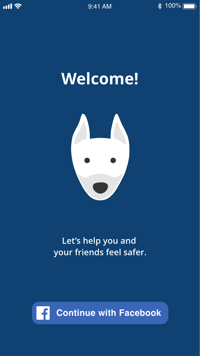
Berkeley is not the safest city. At night, it’s common for students to ask their friends to text them when they get home.

We wanted to get an idea of how safe students feel at Berkeley, as well as methods they take to stay safe when going home at night.

User Research

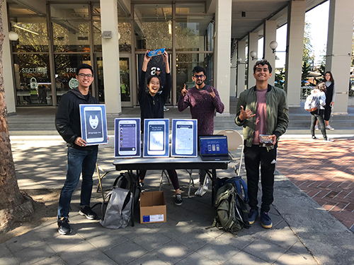
In Fall 2017, we chatted with ~120 students on Sproul about this issue.

In Spring 2018, we conducted 16 in-depth interviews with students on night-time safety.

Main takeaways:

Situation

Students most often walk home alone at night from a friend’s place, a party, or the library.

Safety

Students either:
1) feel safe but cautious because nothing has happened to them, or
2) feel unsafe because of an incident that has happened to them or someone they know.

Safety also correlates with familiarity with the area.

Modes of Communication

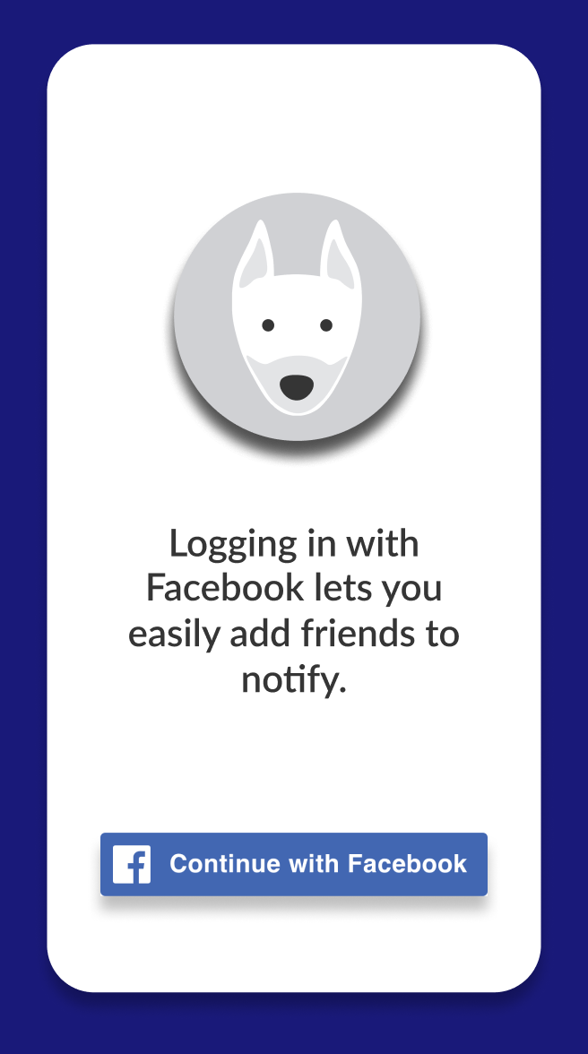
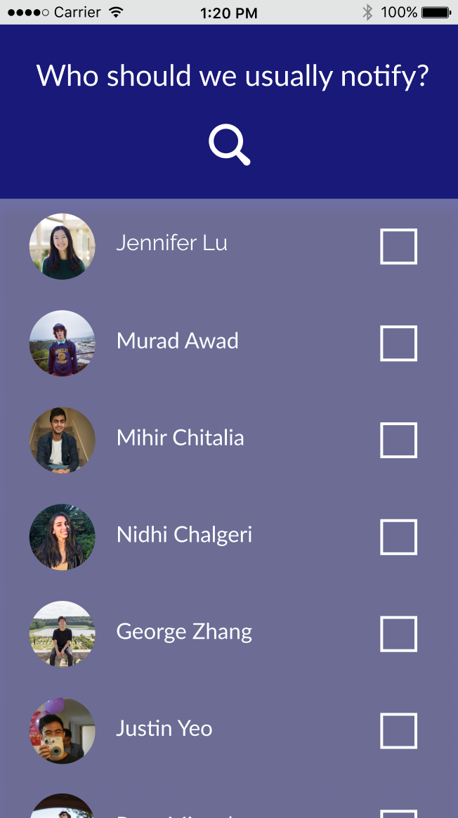
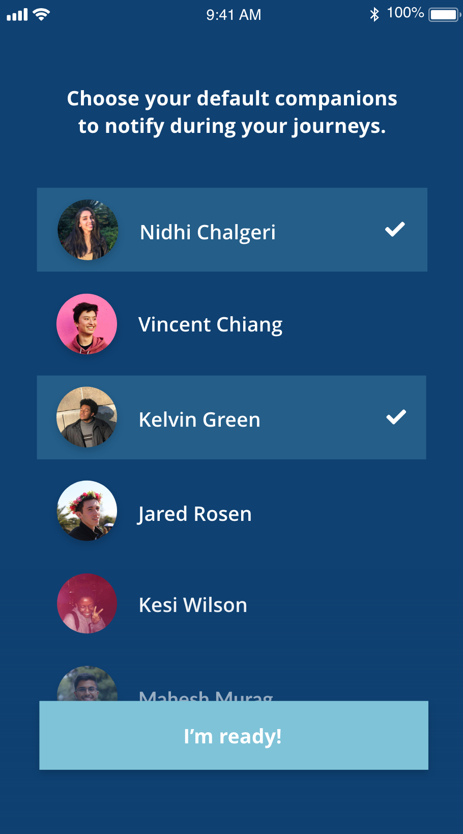
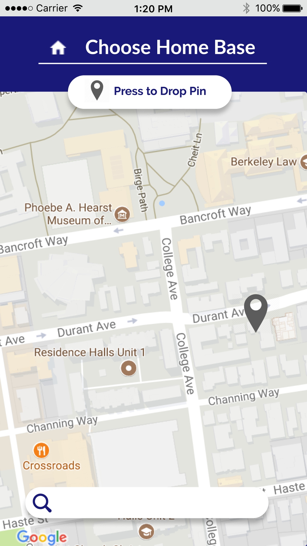
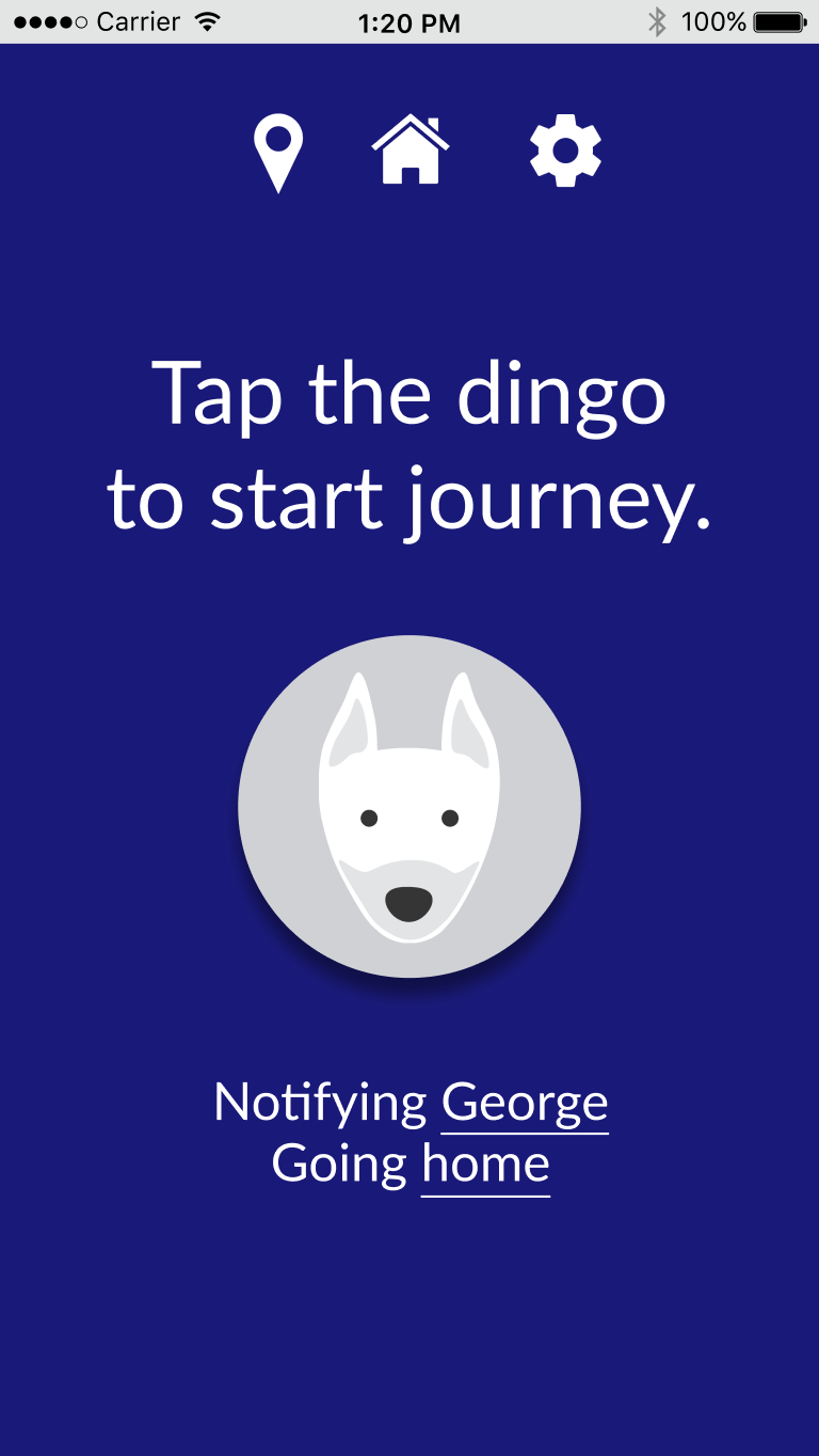
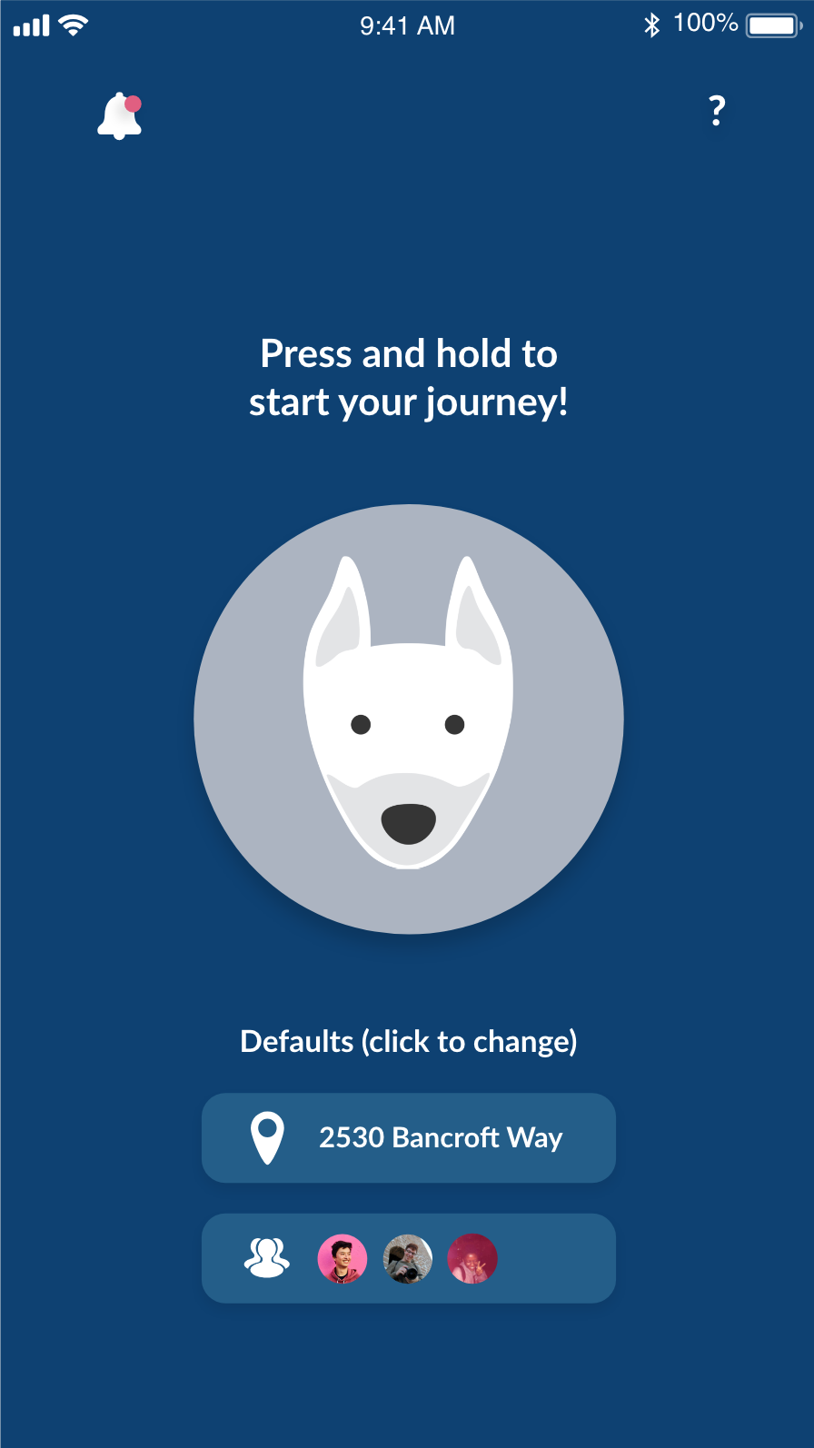
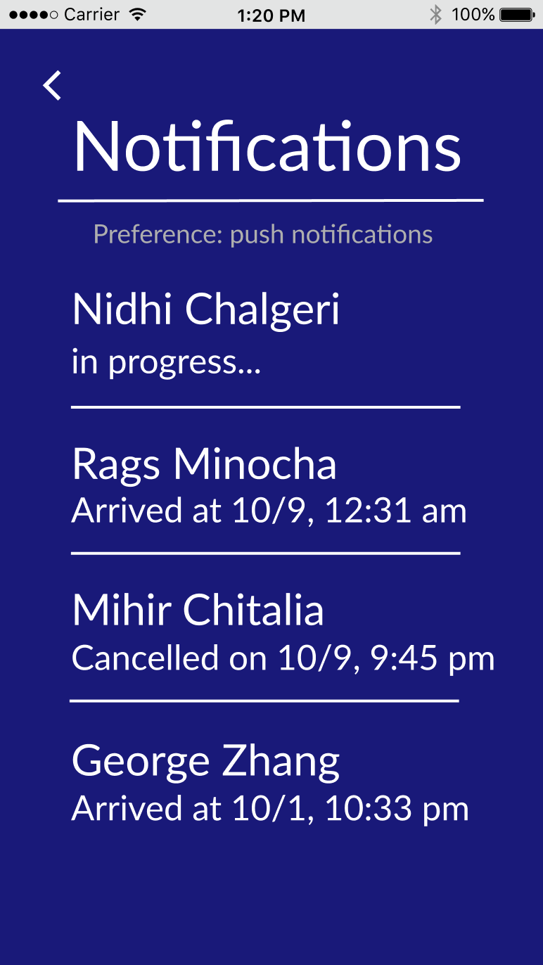
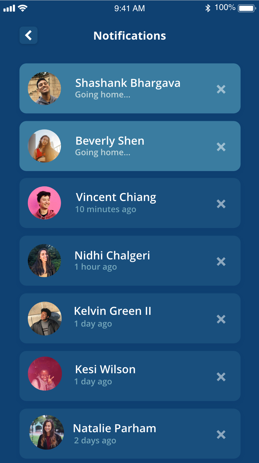
Most students track their friends’ safety either through texting or through Find My Friends. Using location-tracking apps isn’t correlated with the feeling of safety that students experience but rather privacy concerns they may have. The feeling of safety isn’t so extreme that it would prompt location tracking.

When students forget to text their friends that they get home, in most scenarios, their friends either 1) get mildly worried and check-in or 2) forget to check-in. This highlights a problem of lack of normalizing accountability for one's friends' safety.

Target Audience

College students coming home from either the library or late night activities. These students feel some level of danger walking alone at night, but not enough to ask someone to walk home with them and not enough to check in on their friend’s location when their friends walk home.

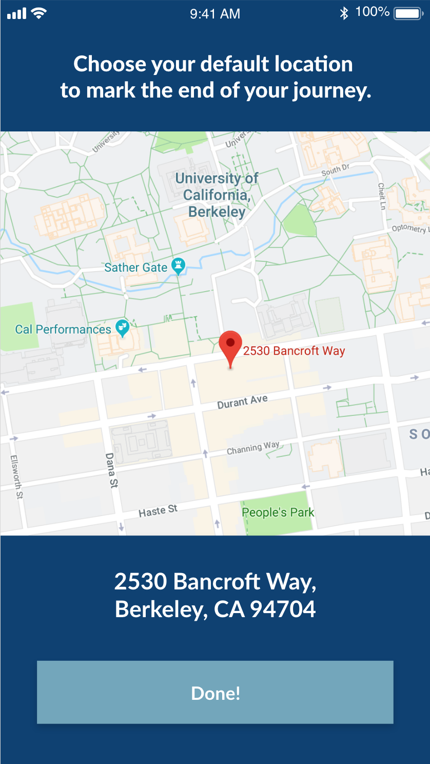
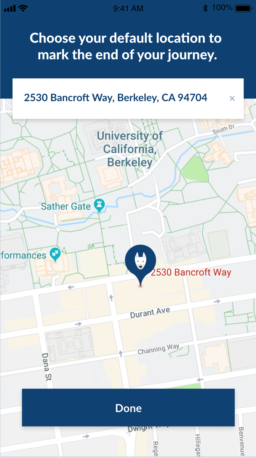
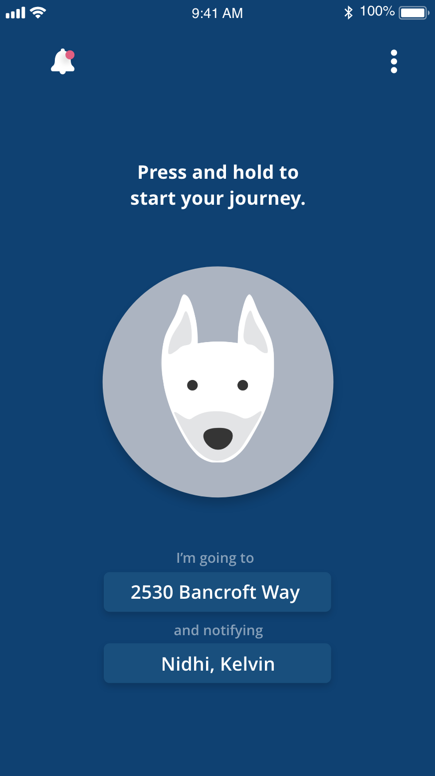
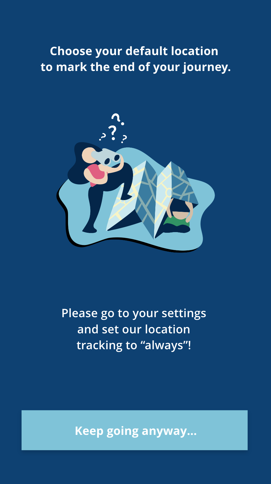
Dingo, as an app, needs to be designed to be easy-to-use (frictionless) for students that see remembering to text as already too much friction. It also needs to be non-intrusive to account for those not willing to constantly share their location with their friend.

Ideation Process

Branding

Dingo is...
1) Fun
2) Reliable
3) Extremely easy to use
4) Non-intrusive

I designed around these characteristics.

Design System

Font: I chose Open Sans to reflect the reliability and ease of use that Dingo aims to have.

Color scheme: I chose a dark color scheme for easier use at night, our targeted time use. I chose navy as the main color because 1) it mimics the night time with a more soothing feel and 2) it is close to the Berkeley logo.

Workflow

Onboarding

I chose to have the user add the default friends and location with the idea in mind that when they open the app, they only need to tap one button when used to go home.

General

I decided to have direct access to all of the app’s functions in the home page to emphasize ease of use. This meant that I had to design the homepage in a way that was clear yet highly functional.

Iterations

Onboarding

Welcome Screen

I wanted the user to immediately feel calm upon loading the welcome screen.

Onboarding Friends Screen

The biggest question here was how to handle scrolling without cluttering the screen. I decided to go without visible table cells so that the interface was cleaner yet the selections were still clear.

Onboarding Location Screen

The biggest question here was also how to keep the screen uncluttered from all of the instructions while still being intuitive. I layered the search bar and the button over the map so that the map could take up a bigger portion of the screen and maintain a cleaner interface.

General

Homepage

I tried out a hamburger style menu and a tab bar, and eventually settled on having most of the functionality on the screen minus the logout and about buttons.

Notifications Page

Here was where I had to consider what users found the most important. I considered having information about which users the current user notified in past trips, but settled on just having notifications for other users' trips upon feedback from peers.

Graphics

I decided to use graphics for two cases: onboarding and “empty” page cases. These graphics had to align with the color scheme as well as carry out the playfulness that the app should present.

Process

Implementation

Final Prototype